Logos
Creating a logo is one of the first things you’re going to find youself doing when your building a personal brand as a designer. Logos are one of those things in design where people can get easily daunted by but as long as you find the ideal process, it can be a lot easier for you, of course it always helps when you are your own client.
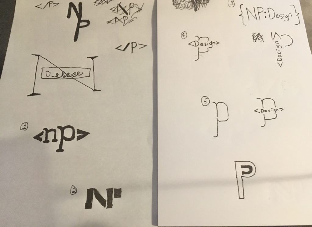
When I’m designing a logo, I always start out by sketching a bunch of my ideas out on paper first, something I never used do but I’ve learned how important it really can be, with paper and pencil you can get down a bunch of ideas in a very short time span and usually one of your ideas can be worked into something workable. Here’s what my final sketchpad (there were a few other pages with logos that went nowhere) looked like when I was making my personal logo.

With these last two pages you can see the final 5 that I numbered out. From this point I went to feedback from my peers to decide which logos I should bring into a digital workspace. In the end I chose to go with 1, 4, and 5 as my logos to digitize.

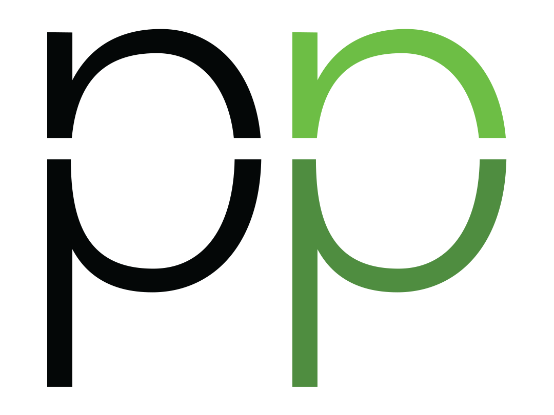
The first logo I want to look at came from my sketch #5. This idea was a play on taking the N and P and combining them into the shape of a P. I think that this idea ended up looking better on paper and in my head and when I was working on it I realized it was a bit hard to make the N really stand out as an N in this design.

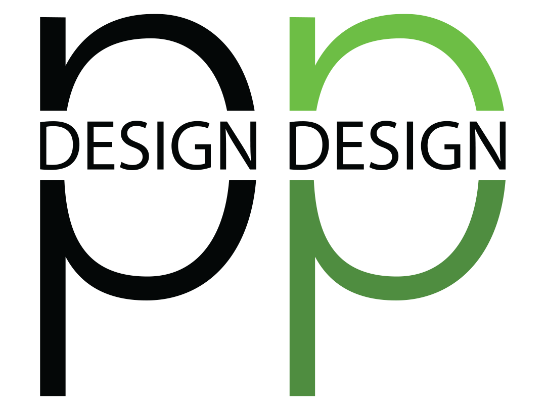
Sketch #4 fared slightly better than #5, the design broke up the N and the P much better and I didn’t hate the logo but I could tell pretty quickly that it wasn’t going to look good if it was scaled down too much. When creating a logo I always try to consider as many places as I can think where the logo would be used and how it would look in that spot, and if this logo was scaled down too much you’d not only loose the text in the center, but may just look like a P with an odd line going through it.

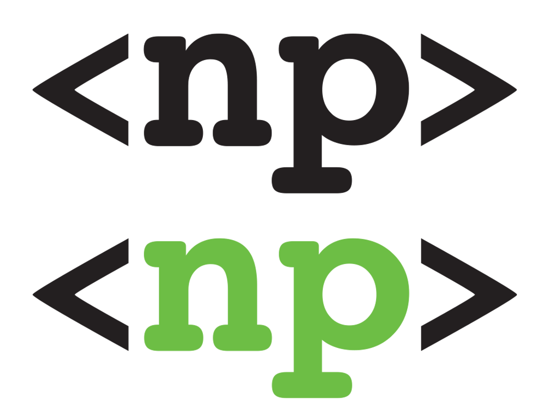
The final sketch I digitized, #1 ended up being my favorite, even though originally I wasn’t in love with it from the sketch alone. Once I got this logo into Illustrator I really loved how the brackets framed the NP and how the letters really popped out at you. I only brought this logo to illustrator because of peers feedback, so really do try and have multiple pairs of eyes on your sketches and designs if you can, another person will see things in your work which you won’t be able to see after staring at it for hours.
In the end, making a logo can be greatly streamlined if you can find the process that works for you. Yours may not look anything like mine, but as long as your design process finishes up with a great product in the end, it’s probably doing something right.